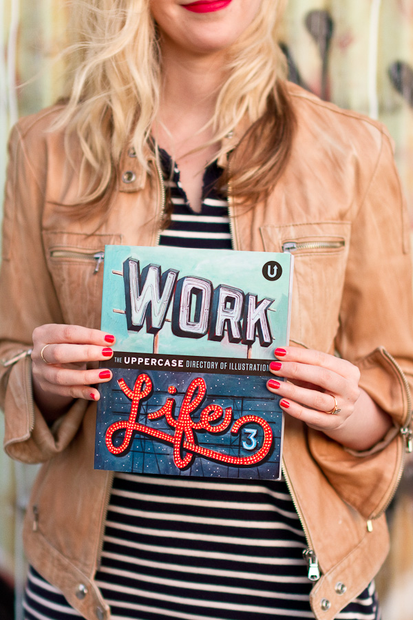
Work/Life 3: Illustration Process
After completing the online questionnaire, Janine supplied me with my illustration brief. Each illustrator would create a custom illustration specifically for Work/Life 3. The following brief was sent to me:
Your Car A Day illustration project was a terrific self-initiated project. I think art directors will be really drawn to its graphic appeal, of repeated similar object isolated on a white background.
Gather a number of significant objects from your personal history and illustrate them. Why are they important? What do they mean to you?
I initially thought sweet, but then I was a little stumped. I did not want the items to be randomly laid out without a sense of relation to my respective age. Story telling was my main priority for this illustration, so I wanted to put some order to the miscellaneous items from different times periods.
To satisfy this desire of storytelling, I decided to make the illustration a map or an info-graphic of sorts that showed a timeline of my life.
My normal process with assignments usually starts off with drawing different on-topic objects. I started to draw all the different items that were important to me. After scanning all of the items in, I started to arrange them according to time.
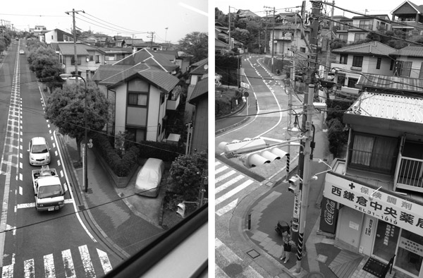
I was fresh off of my trip to Japan and was majorly inspired by the backdrop of power lines and their street infrastructure (street signs, road lines, turning lanes, etc). I was able to incorporate these items and push the illustration to be more visually interesting.
View from the monorail that runs between Enoshima and Ofuna, Japan.
My initial sketch to get all the items laid out chronologically.
The final piece.
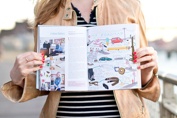
The illustration was submitted in April and by the time July rolled in, I as surprised about how much time went by. In the background, the Uppercase team was busy laying out the book, writing articles, and all the mysterious things that publishers do. So, I was happy to receive the first round of layout proofs in July. After adjusting a few things here and there, I approved the below spread.
And ta-da, there you have it! I hope you can take a minute and read the little notes in the illustration. To wrap up this week, I'll be back tomorrow sharing a few of my significant objects from the illustration. Also, I'll be sharing some other fab illustrators that are featured in the book as well. Until tomorrow!
Work/Life 3: Interview
* Much love to the city I love so much today. I hope all those that still mourn will feel a warm embrace from our city and our world today *
---
With the third installment of Work/Life 3, Uppercase publisher & editor, Janine Vangool, interviewed 100 illustrators via an online questionnaire. A broad span of questions inquired about the ins and outs, ups and downs of illustration.
Here is a sampling of the questions that helped formulate our personal bios:
What is your life story in one paragraph? How and why did you become an illustrator or artist? How would you describe your illustration style? What is your creative process when working on an assignment? What is your favourite thing to draw? What is the best thing and the worst thing about being an illustrator? Has being an illustrator affected your personal life?(ie the choice of where/how you live?) How do you maintain a balance between your work and your life? (or not?) Where do you work? Do you have a studio at home or somewhere else? How is your workspace enhance or hinder creativity? What would be your dream illustration assignment? What is your benchmark for success as an illustrator? Please list up to ten clients or companies that you'd love to work with.
From my answers, the below biography was written. I am really pleased with the inclusion of my family history, how it influences my work habits today, as well as what I try to achieve in my illustrations.
Lindsey Balbierz knows the value of hard work and a good education, attributing this appreciation to her mother who raised Lindsey and her two elder sisters as a single parent. “My mom put all three of us girls through private school and college while she was putting herself through graduate school. I think that is where I learned my work ethic and learned to always set goals.”
Leaving her Cleveland childhood behind, Lindsey set her sights on New York City and attended Parsons’ illustration program. Now, as a freelancer working from her apartment, a daily schedule lends routine to what can be an unpredictable profession. “My fiance and I used to share our second bedroom as our office. I since have moved to the front of our apartment where I can spread out and work amongst my books, sketchbooks, scanner, paints, pencils and inspiration board. I really like to be by myself when I draw so that I can get into my drawing zone. I like to make my studio like a cocoon.”
Lindsey loves getting lost in her work, paying attention to the small details. “I naturally gravitate towards capturing details. I tend to dive into making my pieces really intricate with little narratives going on at different places in the image, creating hidden stories that people have to discover.” This ability to observe and concentrate is exemplified in a recent self-directed project in which Lindsey drew a portrait of a car every day for a month and posted them to her Tumblr. The result is a quirky collection of cars— and documentation of an up-and-coming illustrator with a lot of drive.
Thanks for letting me share the interview process with you. Tomorrow, I finally (!) will share the illustration process from assignment to digital proofs. Hope to see you back here Thursday!
Work/Life 3: Photos
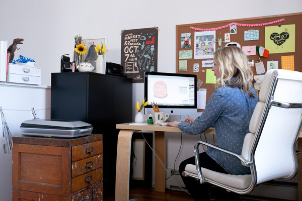
Soon after the excitement of being accepted sunk in, my excitement turned into a mild freak out. I realized each illustrator had to supply their own photographs. Fortunately, Tom has the photography chops I needed. Being engaged to a creative partner has it's benefits! The week after we returned home from Japan, Tom photographed my studio as well as a snaps of myself working. I thought I could share some out-takes as well as some more detail shots that didn't make it into the book.
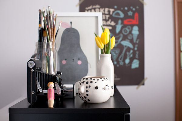
A working studio shot not used in the book:
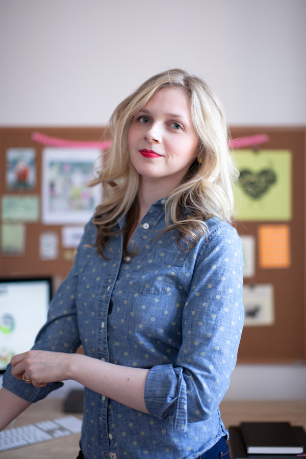
And some outtakes. It's hard to get a good portrait. Praying for a decent shot.
I see you.
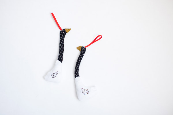
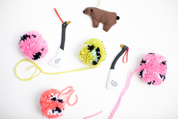
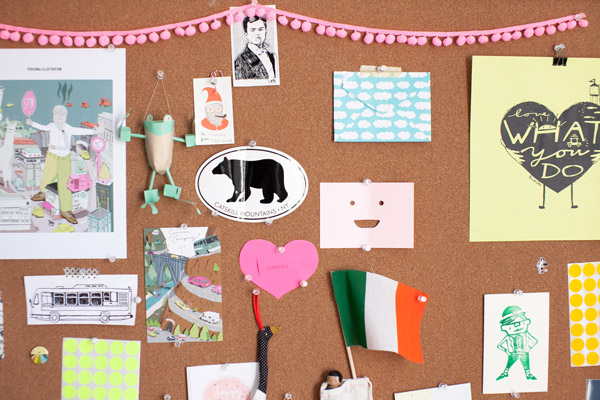
In the end, I supplied a few shots of my studio, my inspiration pin board, my headshot and my handsewn ornaments.
My inspiration board that has little bits of stuff from throughout the years. (Including pieces by [all!] women artists, Lauren Simkin Berke , The Small Object, Jasmine Wigandt, Jensine Eckwall, Adrienne Slane and Laura Berger)
 My desk is never this clean. ;)
An Ikea Carrot and a T-Rex. I took the T-Rex from my old job just a few days before we all got laid off.
And that's a wrap for the photo tour. Big thanks to my man, Tom, for making me look presentable. If you would like to buy the book and check it out for yourself, it's available here. Hope to see you back tomorrow when I talk about the interview process.
Work/Life 3 Week: Intro
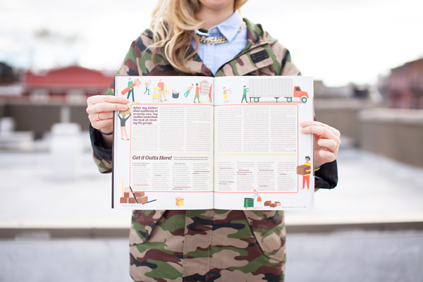
This week, I thought I would share my process in the development of the 2 page spread featuring my work in Uppercase's illustration directory, Work/Life 3.
photo credit: Uppercase
Last year, I had stumbled upon Uppercase's first two Work/Life directories. I loved the illustrators represented in them. I thought, "Wouldn't it be wild if I ever made it into their next illustration annual?" That crazy notion crossed my mind, but I was quick to put my nose back into creating more work.
Fast forward a few months to February 2013. I read about their call for entries on Twitter. I immediately entered to be considered for their curatorial process. To my surprise, I heard back that very night that I had been accepted. Not only was I surprised that I was accepted, but I was so impressed with editor, Janine Vangool's, promptness and thoroughness with preliminary book information. I knew right away that Uppercase was a publishing house that was incredibly professional and would be an honor to work with.
 To describe the book, I'll use the words Uppercase has released:
With the third edition of the UPPERCASE directory of illustration, we are pushing the personal nature of Work/Life to a new level. This edition's theme is "An Illustrated Life" in which we explore the ups and downs of illustration and what it takes to stay creative 24/7. Each participant offers their unique take on this theme and have created an original illustration based on a bespoke assignment specific to their interests and story given to them by UPPERCASE editor Janine Vangool.
Unlike awards annuals or traditional illustration directories, our publication is personal. One hundred artists from around the world were individually interviewed about their creative focus and artistic technique as well as their inspirations and aspirations. Additional imagery (sketchbook pages, studio shots, inspirational objects) are integral to each participant’s spread, allowing the reader to take a peek into their entire working lives.
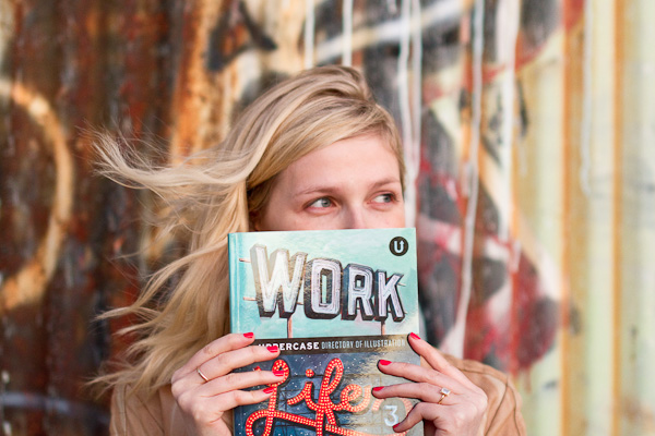 All other Photos Credited to Tom Takigayama
I'm looking forward to sharing more about the process with you readers this week. Everyday, I will post something different, the interview, the photos, the illustration process, and I'll even share the personal items I represented in my illustration. Hope to see you back tomorrow.


